Noodle Farm
Visual Design / Packaging Design / Project Management
Refresh a noodle brand
Sharing a traditional noodle shop with a new generation of customers
About the brand
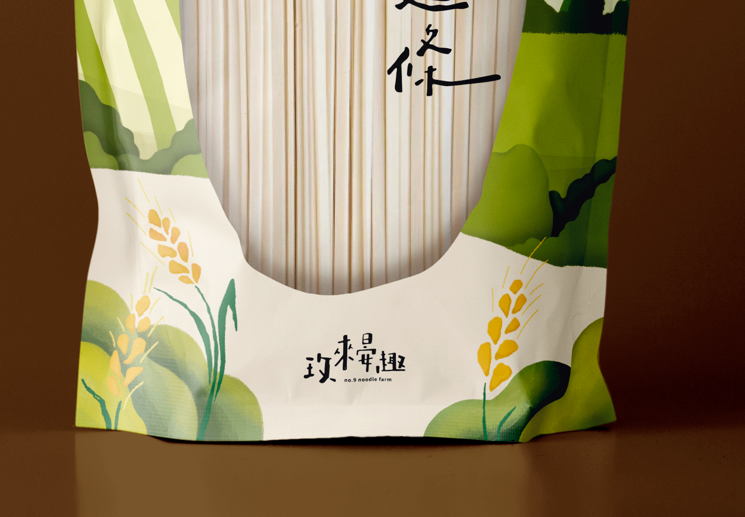
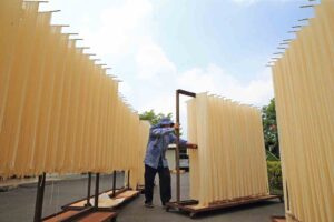
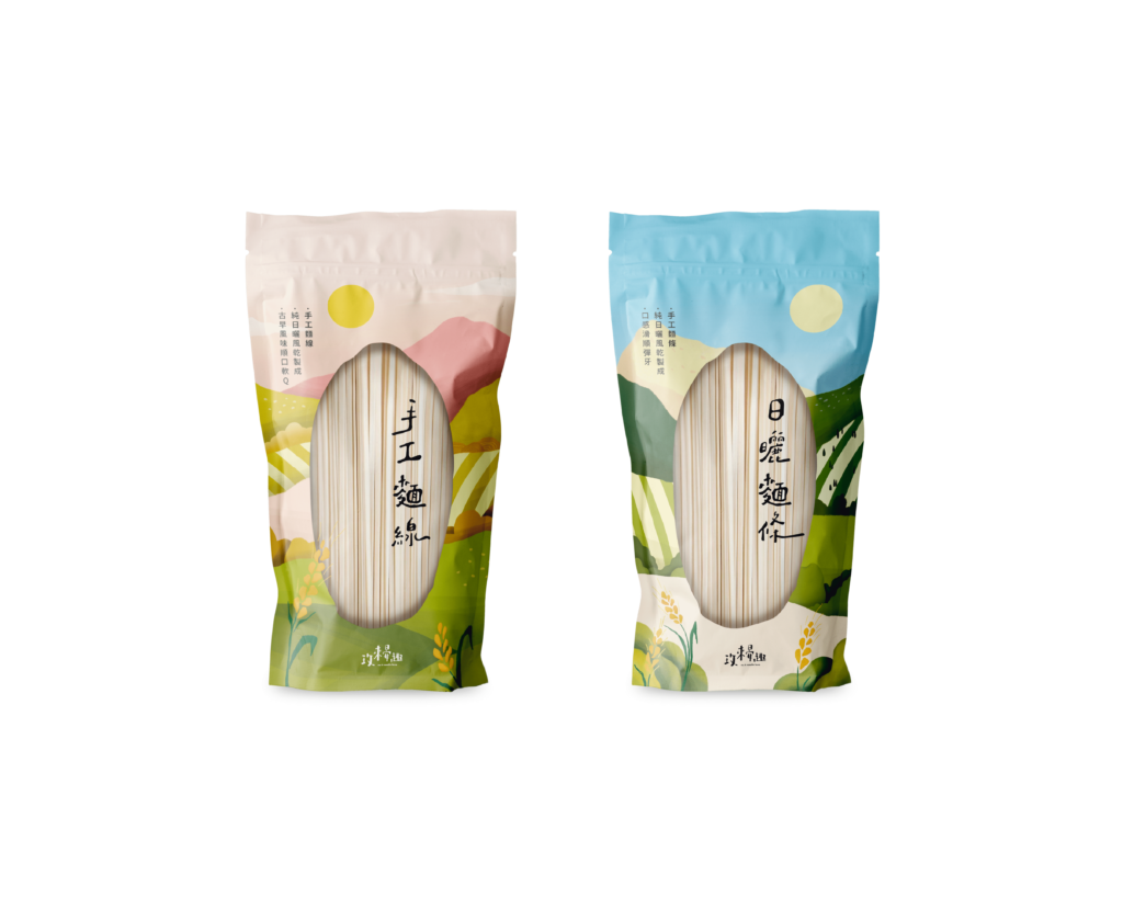
I revitalized the brand visuals for a noodle farm, specialising in sundried noodles. The noodle shop owners were looking to attract younger customers to their product. Because the noodle farm made their noodles by hand using natural ingredients, we decided to create a design that looked handwritten, to reflect the simple purity of their food.
My Role
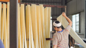
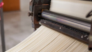
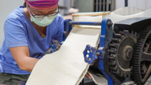
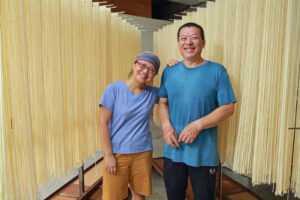
My goal was to introduce the clients’ personalities and the local environment into the visuals of the brand. During the design process, I visited the noodle farm in-person at sunrise to help with the noodle-making. This experience helped me to gain a better understanding of the clients, their product and the environment, so their new designs could feel as authentic as their product.
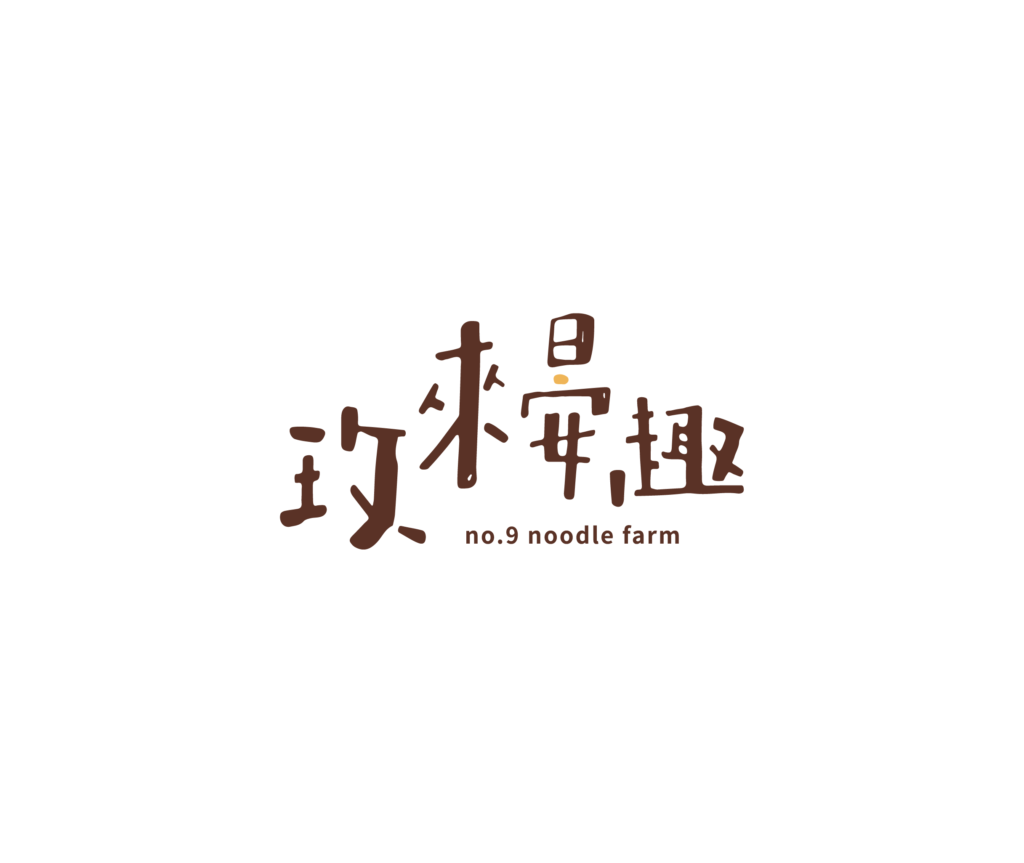
Handwritten Logo
Embracing a simple, unadorned approach to convey the brand’s commitment to pure, comforting, and warm ingredients. The design aims to resonate with consumers by creating a sense of reassurance and a cozy atmosphere.
Hand-Drawn Illustrations
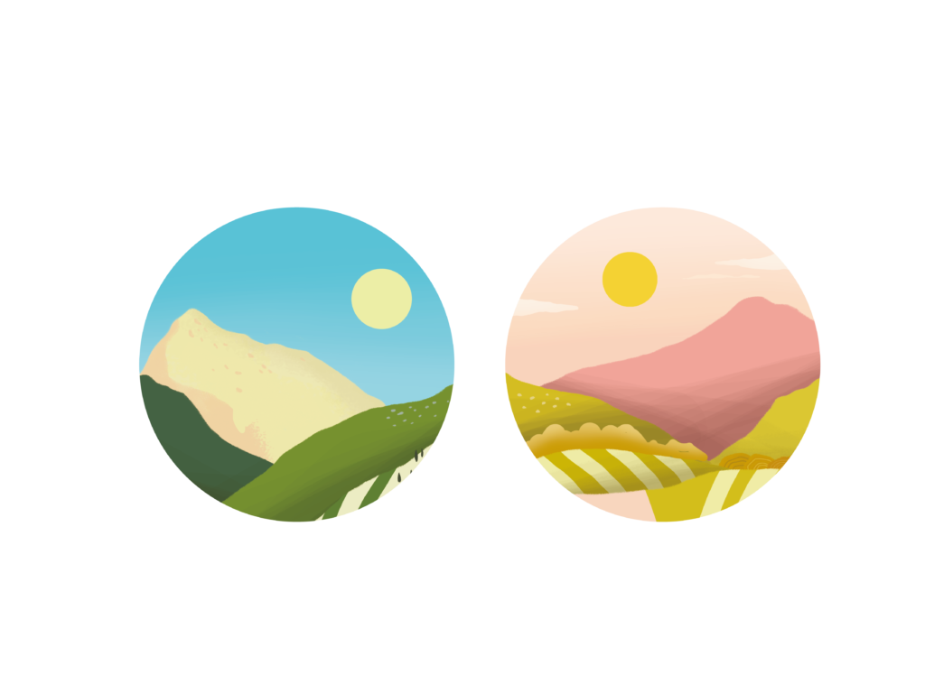
For my refreshed design of the noodle packaging, the noodle shop owners requested that I include an illustration of mountains, because the local noodle shop is located in the mountainous Pingtung region of Taiwan. During my time working with the noodle shop owners, I was also inspired by their warm friendly personalities, so I used bright colours and a hand-drawn art style to reflect the way our interactions made me feel.
