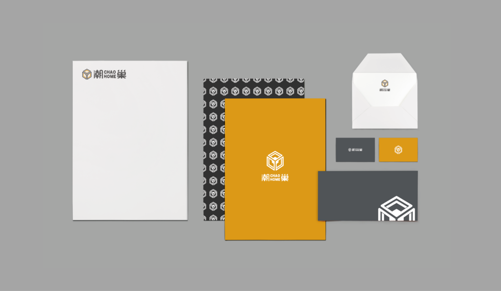
Chao Home
Visual Identity
About Chao Home
ChaoHome is a cultural event organized by the local government, connecting the present, the past, and the future.
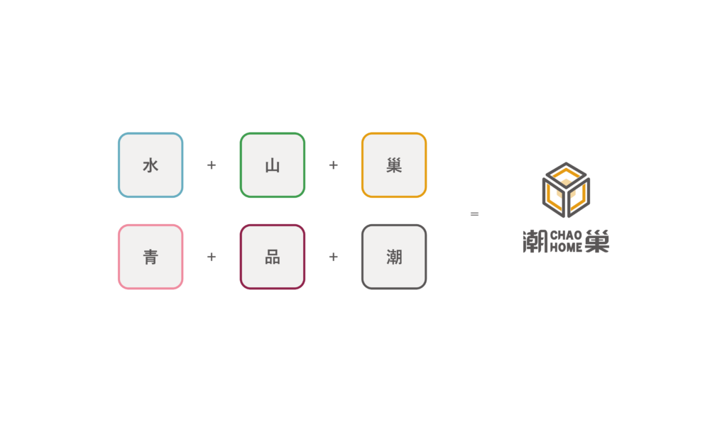
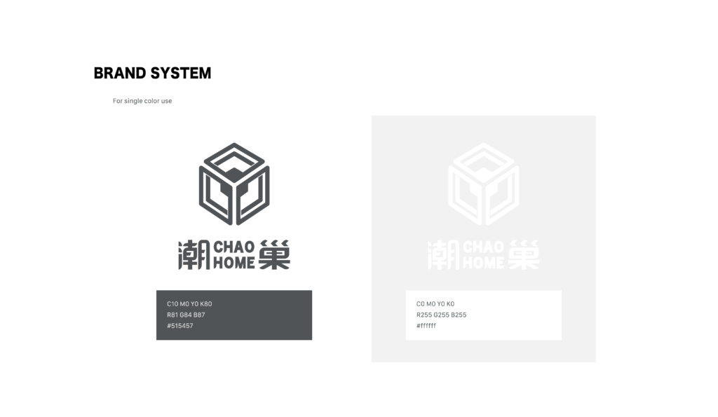
The settlement of Chaozhou encompasses diverse ethnic groups, gathering various facets of life and culture. The logo with its six faces resembling a cube, symbolizes the integration of diverse ethnic groups and cultures, continuously rotating and evolving. It symbolizes the infinite possibilities of blending Chaozhou’s past with its future.
My Role
As the VI designer, I brainstormed ideas with the team and made the logo independently, enhancing the message by using the visual design. I also joined the event and took the photography duties.
What does ‘潮巢’ mean?
潮 represents the dawn of a new day, symbolizing the imminent change in Chaozhou. And 巢 implies the idea of returning home.
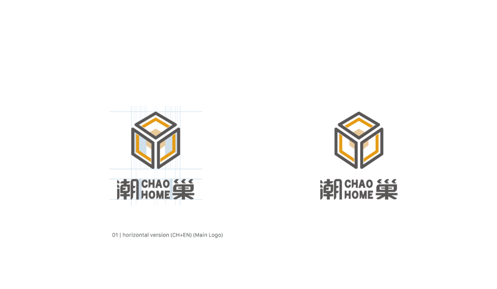
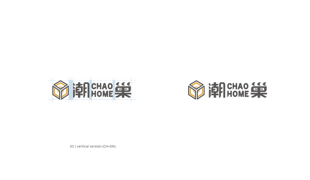
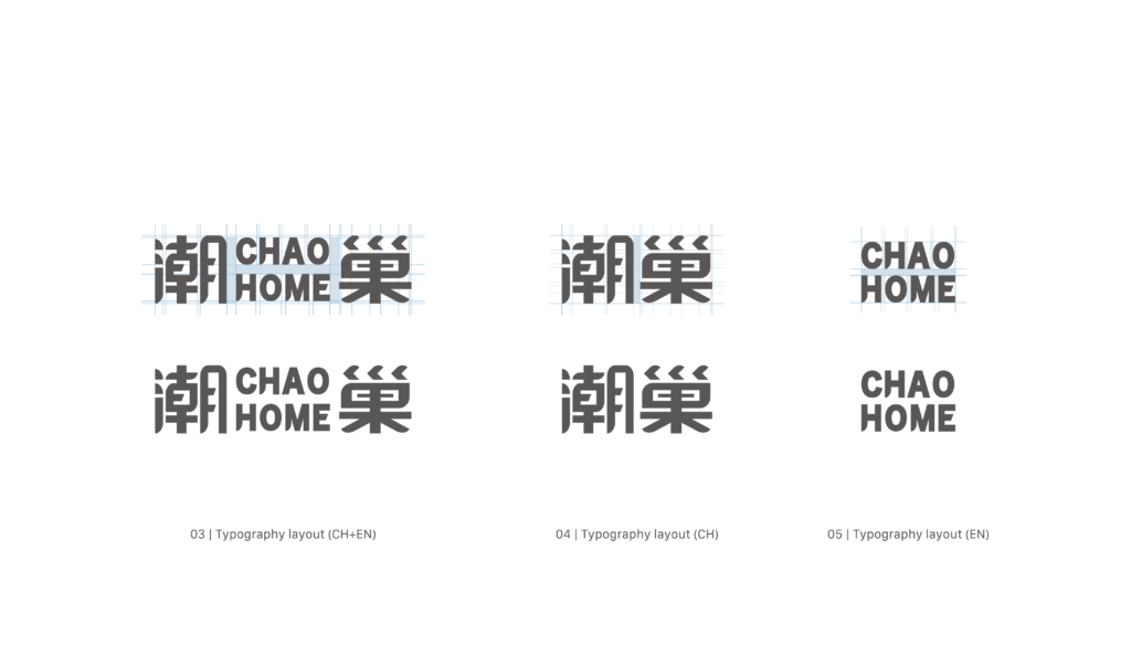
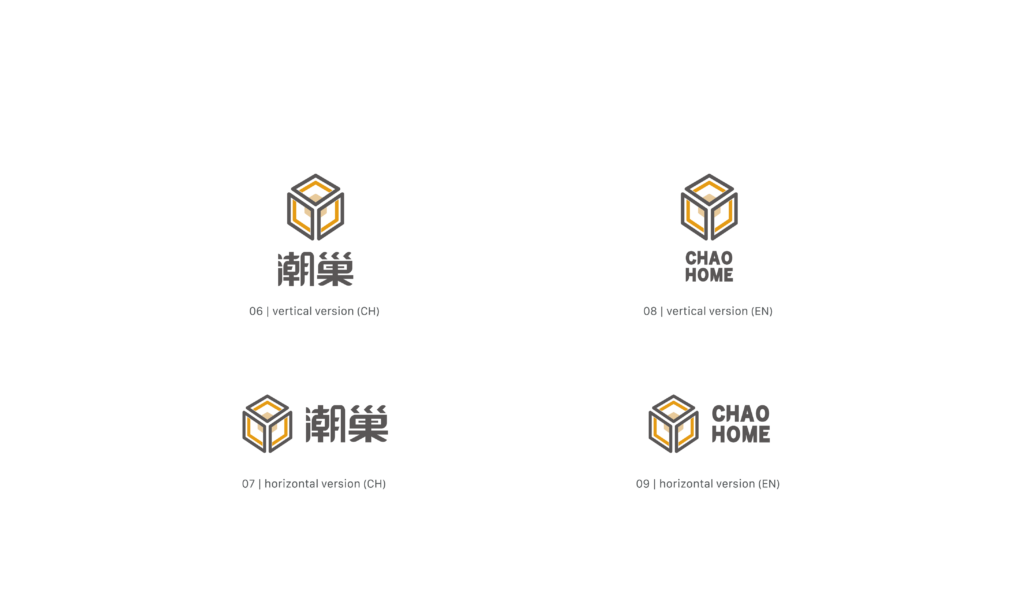
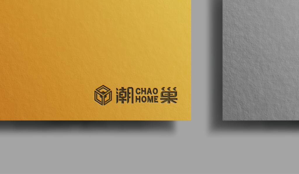
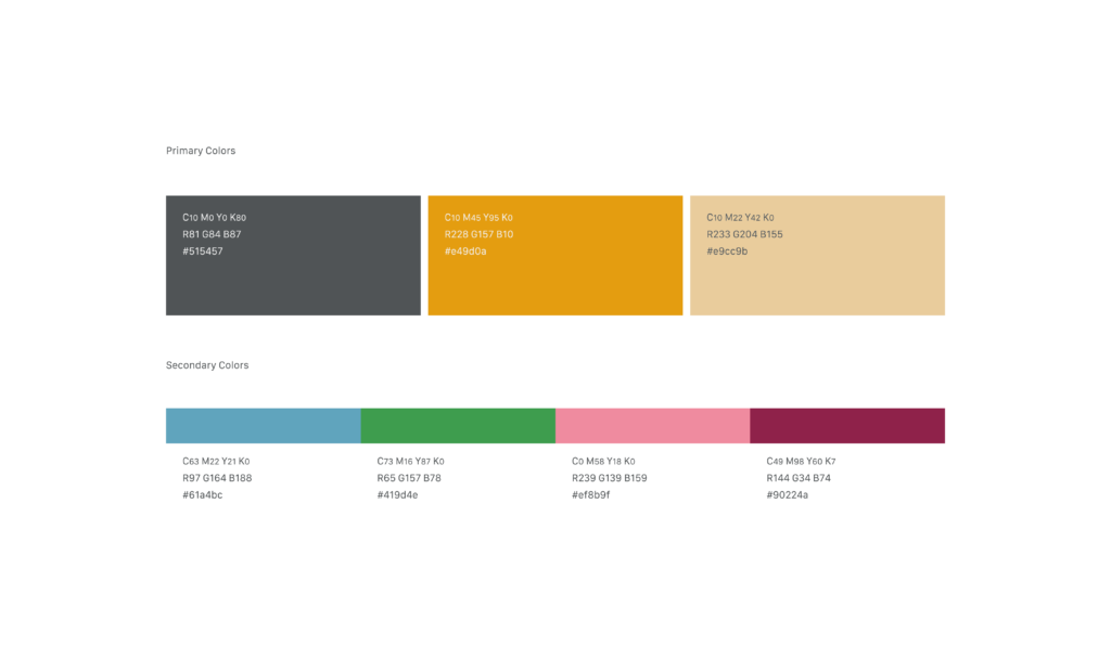
Chao Nest, an innovative contemplatio of young people returning to their hometown from the old days, gradually evolving. It’s a new step towards change. Home is a concept, and the nest represents the deeper essence and content of tilling the land in one’s hometown. Using orange as the representative color of the nest brings out the inherent warmth of home.
Chaozhou, this small town, is indeed a solid core hometown. The return of young people brings new ways of thinking and tending to this land, creating new stories and enhancing its intrinsic richness. This phase represents the texture carved by the integration of tradition and generations.
